Learning objectives
- Learn how to create beautiful and informative plots from data
- Understand the grammar of graphics implemented in
{ggplot2}and how to create plots in “layers”
- Learn core
{ggplot2}geometries likegeom_point(),geom_line(),geom_col(),geom_boxplot(),geom_histogram() - Understand how to customize and save plots
Data visualization with {ggplot2}
Data visualization allows us to effectively explore data in an Exploratory Data Analysis (EDA), and allows us to communicate the results of an analysis or modeling exercise. A powerful package for data visualization in R is {ggplot2} (part of the {tidyverse} set of packages). {ggplot2} stands for “grammar of graphics plot” and generally provides a semantic syntax for data visualization that breaks down graphs in terms of aesthetics, geoms, coordinates, scales, and more, which allows users to create visualizations that range from simple to extraordinarily complex. The act of creating visualizations is not only useful, but also fun and motivating, so we cover it early, before more advanced data manipulation in subsequent modules. By the end of this module you will be able to create beautiful ggplots made entirely in R, and take your first steps towards reproducible and elegant data visualization.

Figure 1: Illustration by @allison_horst.
Examples
Before we begin, below are a few plots created entirely with {ggplot2} to illustrate the possibilities for data visualization enabled by this package.
These are only a few examples of the many possibilities that can be made. Because ggplots are so customizable, some people even use {ggplot2} to create artwork1. Once you are familiar with how to customize a ggplot, you may be surprised to see them appear in major news outlets and scientific publications.

Figure 2: Evolution of a ggplot, by Cedric Scherer shows how one can progressively refine and customize a gpplot.

Figure 3: Created by Timo Grossenbacher @grssnbchr.

Figure 4: Travelling to Outer Space by Cédric Scherer @CedScherer.
Creating your first ggplot
To begin, we load the {ggplot2} package. We can load it independently, but let’s load it along with the {tidyverse} suite of R packages used in this course. We also need to load some data. Below we load a pre-processed dataframe that we’ll create later in the module on joins and binds.
# includes ggplot2
library(tidyverse)

# groundwater level from a single station in Sacramento County
gwl <- read_csv("data/gwl/gwl.csv")

# inspect the data
head(gwl)
# A tibble: 6 × 10
SITE_CODE MSMT_DATE WSE GSE_WSE WLM_ORG_NAME LATITUDE LONGITUDE
<chr> <date> <dbl> <dbl> <chr> <dbl> <dbl>
1 384121N121… 2020-07-02 -25.2 159. Southeast S… 38.4 -121.
2 384121N121… 2020-06-26 -24.8 159. Southeast S… 38.4 -121.
3 384121N121… 2020-06-19 -25.4 159. Southeast S… 38.4 -121.
4 384121N121… 2020-06-12 -25.2 159. Southeast S… 38.4 -121.
5 384121N121… 2020-04-17 -21.1 155. Southeast S… 38.4 -121.
6 384121N121… 2020-03-20 -21.8 156. Southeast S… 38.4 -121.
# ℹ 3 more variables: COUNTY_NAME <chr>, WELL_DEPTH <dbl>,
# WELL_USE <chr>The 10 columns in the data contain are a SITE_CODE or unique identifier, a date-time MSMT_DATE, a water surface elevation WSE_FT, and a depth to groundwater GSE_WSE, the agency that collected the measurement WLM_ORG_NAME, a latitude and longitude, the county, the well depth, and the well use.
Perhaps we want to visualize the depth to groundwater at this site over time. To do this, we put MSMT_DATE on the x-axis and GSE_WSE on the y-axis.
To create a ggplot we start with the function ggplot().
ggplot()
The above plot appears blank because we haven’t added any layers to it! A ggplot is nothing until we layer on one or more geometries or geoms.
Adding geom_ layers
Let’s add a geom_line() layer to the ggplot() we created above.

Let’s break down what we just did:
ggplot(data = <DATA>) +
<GEOM_FUNCTION>(mapping = aes(<MAPPINGS>))We start creating a plot with the ggplot() function with our data (data = gwl). With {ggplot2}, each layer or piece of the ggplot is added by using a +. We added a geom_line() which connects data points with a line, but there are many other geoms, including geom_point(), geom_col(), geom_boxplot(), geom_histogram(), and so on. Inside each geom_, there are many options, but the core arguments that allow us to tell the geom_line() function to put the date on the x-axis and depth to groundwater on the y-axis are arguments data and mapping . For the data, we are using the data specified in the ggplot(data = gwl) line, which means that data is available for any future layer or geom we use. To specify what pieces go on the x-axis and y-axis, we use the mapped aesthetics, mapping = aes(x = MSMT_DATE, y = GSE_WSE).
In practice, we don’t need to explicitly write out all of the full argument names. {ggplot2} understands that mapping aes(MSMT_DATE, GSE_WSE) means that the measurement date and depth to groundwater belong on the x and y axis respectively. However, it is always a good idea to explicitly specify the data argument no matter what to avoid potential errors.
We can change the geom to a point:
ggplot(data = gwl) +
  geom_point(aes(MSMT_DATE, GSE_WSE))
Many points overlap, making them hard to pick apart. Let’s make them 50% opaque with the alpha argument.
ggplot(data = gwl) +
  geom_point(aes(MSMT_DATE, GSE_WSE), alpha = 0.5)
We can change the geom to an area (notice that the y axis scale now has a minimum of 0):

We can add more than one geom to the plot (just link them with the +), for instance a point and line. We can also set the color of a geom with the color argument.
ggplot(data = gwl) +
  geom_point(aes(MSMT_DATE, GSE_WSE), alpha = 0.5) +
  geom_line(aes(MSMT_DATE, GSE_WSE), color = "red", alpha = 0.7)
It’s often useful to summarize large datasets using summary values like the median, mean, interquartile range, and so on. What does the distribution of depths to groundwater look like at this particular well?
ggplot() +
  geom_histogram(data = gwl, aes(x = GSE_WSE))
Notice that geom_histogram() takes only one argument for the x-axis and computes the bins for the y-axis. It appears that depths to groundwater range from around 130 to 160, with a median around 145. The default number of bins used is 30, but we can change this value.
ggplot(data = gwl) +
  geom_histogram(aes(x = GSE_WSE), bins = 100)
Challenge 1: You Try!
- Modify the plot above to make the histogram blue (Hint: use
fill = "blue").
- In the code above, change
geom_histogram()togeom_boxplotand remove anybinsandfillarguments.
Click for Answers!
ggplot(data = gwl) +
  geom_histogram(aes(GSE_WSE), bins = 100, fill = "blue")
ggplot(data = gwl) +
  geom_boxplot(aes(GSE_WSE))
Aesthetics
Aesthetics, or aes() as we have seen, are how geoms map variables onto a plot. So far, we have only used the x and y aesthetics to map variables onto an x and y coordinate system. We can also add a third variable, like color to the aesthetics, and map values in the data to different colors.
So far, we’ve been working with one monitoring site in Sacramento County, but to illustrate how mapping a variable to color can be useful, let’s read in a slightly larger version of this groundwater level dataset that includes data from 10 monitoring sites in Sacramento and Placer counties.
# groundwater level from 10 monitoring sites in Sacramento and Placer counties
gwl_10 <- read_csv("data/gwl/gwl_10.csv")

# plot
ggplot(data = gwl_10) +
  geom_point(aes(MSMT_DATE, GSE_WSE))
Pause for a moment to consider why does this data does not appear to have a clear trend.
Let’s verify there are 10 unique sites in the data, then re-plot, and color the points by the SITE_CODE by assigning the variable SITE_CODE to the color argument inside the aes().
# unique site codes in the dataframe
unique(gwl_10$SITE_CODE)
[1] "382913N1213131W001" "384082N1213845W001" "385567N1214751W001"
[4] "386016N1213761W001" "387511N1213389W001" "388974N1213665W001"
[7] "383264N1213191W001" "382548N1212908W001" "388943N1214335W001"
[10] "384121N1212102W001"# re-plot with color as an aesthetic
ggplot(data = gwl_10) +
geom_point(aes(x = MSMT_DATE, y = GSE_WSE, color = SITE_CODE), alpha = 0.5)
It’s now clear now which points belong to which group. Above, we mapped colored points by a categorical variable (SITE_CODE), but we can also color by a continuous variable, like the well depth.
# color the continuous well depth variable
ggplot(data = gwl_10) +
  geom_point(aes(x = MSMT_DATE, y = GSE_WSE, color = WELL_DEPTH))
What if we were curious to know the distribution of depth to groundwater (y axis) at each of the 10 sites (x axis) in the gwl_10 dataset?
ggplot(data = gwl_10) +
  geom_boxplot(aes(x = SITE_CODE, y = GSE_WSE))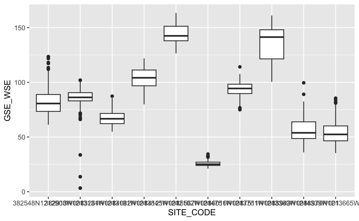
Those x axis labels are hard to read. What happens if we switch the x and y aesthetics?
ggplot(data = gwl_10) +
  geom_boxplot(aes(x = GSE_WSE, y = SITE_CODE))
That’s easier to read. Let’s also add some more intuitive labels.
ggplot(data = gwl_10) +
  geom_boxplot(aes(x = GSE_WSE, y = SITE_CODE, color = WELL_USE)) +
  labs(y = "",
       x = "Depth to groundwater (ft)",
       color = "Well type",
       title = "Depth to groundwater at 10 monitoring sites",
       subtitle = "Sacramento and Placer county (1960-present)",
       caption = "Source: Periodic groundwater level database, CA-DWR.")
Faceting
Faceting is a powerful way to split a plot by a categorical variable into many subplots, or facets.
ggplot(data = gwl_10) +
  geom_line(aes(MSMT_DATE, GSE_WSE)) +
  facet_wrap(~SITE_CODE)
We can improve the plot above by noticing that there are 10 facets, which would fit well into a grid of 5 rows and 2 columns, and also if we “freed” the scales so that they didn’t all have the same x and y axis limits. We can achieve these changes by modifying the nrow, ncol, and scales arguments.
ggplot(data = gwl_10) +
  geom_line(aes(MSMT_DATE, GSE_WSE)) +
  facet_wrap(~SITE_CODE, ncol = 2, scales = "free")
You can also facet by 2 variables with facet_grid(). Here we facet by the county name and well use, and also separate individual sites within each facet by specifying group = SITE_CODE.
ggplot(gwl_10) +
    geom_line(aes(MSMT_DATE, GSE_WSE, color = WELL_USE, group = SITE_CODE)) +
    facet_grid(COUNTY_NAME~WELL_USE, scales = "free")
What would happen if group = SITE_CODE were not included?
Challenge 2: You Try!
- Modify the plot above to color by the well use. (Hint: add
color = WELL_USEinside theaes()function).
- Using the
gwl_10dataset, create a new ggplot. Usegeom_line()to mapMSMT_DATEto the x-axis andGSE_WSEto the y-axis. Then, color by theSITE_CODE, and facet by theWELL_USE.
Click for Answers!
ggplot(data = gwl_10) +
  geom_line(aes(MSMT_DATE, GSE_WSE, color = WELL_USE)) +
  facet_wrap(~SITE_CODE, ncol = 2, scales = "free")
# color the continuous well depth variable
ggplot(data = gwl_10) +
  geom_line(aes(MSMT_DATE, GSE_WSE, color = SITE_CODE)) +
  facet_wrap(~WELL_USE, ncol = 1)
Saving plots
There are two main ways to get plots out of R and into a file, using a graphical device, or using a ggplot function ggsave.
Saving with a graphical device
To save using a graphical device, we essentially prepare a file of the type we want (i.e., a pdf or png or jpg). This is the “graphical device”. Once we’ve opened our blank graphical file, we print the plot, and then close the device. This method (using a graphical device) works with any graphical output from R, not just ggplot.
# create a plot and save it to a variable
my_plot <- ggplot(data = gwl_10) +
  geom_line(aes(MSMT_DATE, GSE_WSE, color = WELL_USE)) +
  facet_wrap(~SITE_CODE, ncol = 2, scales = "free")

# open a PDF graphical device
pdf("results/my_plot.pdf")

# print the plot
my_plot

# close the graphical device
dev.off()
quartz_off_screen
2 We can print multiple plots into a PDF graphical device.
# create a plot and save it to a variable
my_plot_2 <- ggplot(gwl_10) +
  geom_line(aes(MSMT_DATE, GSE_WSE, color = SITE_CODE)) +
  facet_wrap(~WELL_USE, ncol = 1)

# open a PDF graphical device
pdf("results/my_plots.pdf")

# print the plot
my_plot
my_plot_2

# close the graphical device
dev.off()
quartz_off_screen
2 # we will get a message about how many screens we still have open...this is ok!We can save a png file in the same way, and specify output height and width.
# open a PNG graphical device
png("results/my_plot.png", width = 10, height = 7, units = "in", res = 300)

# print the plot
my_plot

# close the graphical device
dev.off()
quartz_off_screen
2 Saving with ggsave()
Another way to save ggplots that involves less code is to use the ggsave() function. By default, ggsave() height and width arguments are understood to be in units of inches. This approach only works with plots that have been generated using the {ggplot2} package. To save different file types, we simply change the file extension to the format we want.
Colorblindness
Global estimates suggest that 8% of men and 0.5% of women experience some form of colorblindness. When creating data visualizations, default palettes may not be colorblind-safe. Fortunately, {ggplot2} includes options for colorblind-safe scales. These can be used with both color and fill aesthetics by adding the scale_<color or fill>_viridis_<c or d> functions to our ggplots.
ggplot(data = gwl_10) +
  geom_line(aes(MSMT_DATE, GSE_WSE, color = SITE_CODE)) +
  scale_color_viridis_d() # a "discrete" viridis color palette.
Above, the variable we want to map WELL_USE is mapped to a color and is a discrete variable, therefore, we use scale_color_viridis_d().
If we were mapping a continuous variable to color we would use scale_color_viridis_c().
ggplot(data = gwl) +
  geom_line(aes(MSMT_DATE, GSE_WSE, color = MSMT_DATE)) +
  scale_color_viridis_c(trans = "date")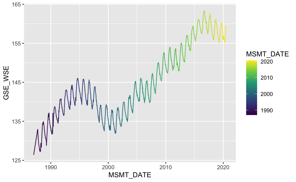
We can toggle color palettes, and reverse them. See the {viridis} vignette for more info.
ggplot(data = gwl) +
  geom_line(aes(MSMT_DATE, GSE_WSE, color = MSMT_DATE)) +
  scale_color_viridis_c(option = "B", direction = -1, trans = "date")
Bespoke plots
What we’ve covered is just the tip of the iceberg. There are many, many more geoms, aesthetics, themes, scales, coordinates, and graphical libraries that extend the capabilities of ggplot. Once you have a handle on the grammar of graphics, bespoke plots are not far from your reach.
Adjusting the theme() of a plot is a powerful way to customize the look and feel of the visualization. For example, we may improve the plot below by simply applying one of many preset themes (“theme_<name>”) and increasing the base_size.
p <- ggplot(data = gwl) +
  geom_line(aes(MSMT_DATE, GSE_WSE, color = MSMT_DATE)) +
  scale_color_viridis_c(option = "B", direction = -1, trans = "date") +
  theme_minimal(base_size = 14)
p
Let’s remove minor gridlines with a general call to the theme() function and specifying that the panel.grid.minor argument is a blank element.
p <- p +
  theme(panel.grid.minor = element_blank())
p
We can move the legend inside the plot area with another theme() argument, legend.position.
# place the legend position 90% along the x axis, and 25% along the y axis
p + theme(legend.position = c(0.9, 0.25))
We can also move the legend to the top of the plot. If you type legend.position and read the documentation in the RStudio script editor, you’ll notice the position argument options.

p + theme(legend.position = "top")
Now let’s make the colorbar longer and thinner, move the legend title to the top, and center it. We’ll also overwrite our former plot with this new one.
p <- p +
  theme(legend.position = "top") +
  guides(color = guide_colorbar(barwidth = unit(20, "lines"),
                                barheight = unit(0.5, "lines"),
                                title.hjust = 0.5,
                                title.position = "top"))
p
We can add a trend line by fitting a linear model to these data.
p <- p +
  geom_smooth(data = gwl, aes(MSMT_DATE, GSE_WSE),
              method = "lm", se = FALSE, linetype = "dashed")
p
Finally, let’s format some labels.
p <- p +
  labs(x = "", y = "Depth to groundwater (ft)",
       title = "Site code: 384121N1212102W001",
       caption = "Source: Periodic groundwater level database, CA-DWR.")
p
Just about every aspect of plots can be customized with arguments in the theme() function. See ?theme for a full list of options to customize.
Built-in themes are also a quick way to change the look of your plots. Let’s start over with a basic plot, view some built-in themes.
# basic plot
p <- ggplot(data = gwl) +
  geom_line(aes(MSMT_DATE, GSE_WSE))

# a built in theme
p + theme_bw()
# another built in theme
p + theme_dark(base_size = 18)
Extra Practice
There are many built-in themes in {ggplot2}. Add a theme you haven’t tried before to the p object from above. Type “theme_” and hit Tab to view options.
Click for Answers!
p + theme_classic() 
Extending ggplot2
If you want to learn more about {ggplot2}, check out these two free online resources:
- ggplot2: elegant graphics for data analysis: This is the definitive ggplot2 guide written by the package author that emphasizes code and ggplot2 fundamental skills and concepts.
- Fundamentals of Data Visualization: This book emphasizes principles of good data visualization that will inform the graphics you create.
Previous module:
4. Import/Export Data
Next module:
6. Data Structures