Learning objectives
- Understand when and how to carry out Exploratory Data Analysis (EDA)
- Practice EDA with tools and data from previous modules
What’s EDA?
Exploratory Data Analysis, or EDA, is an approach to data analysis that allows the data analyst to explore data and identify hypotheses or additional questions to test. In the book, R for Data Science, EDA is described as an iterative cycle where you:
- Generate questions about your data.
- Search for answers by visualizing, transforming, and modeling your data.
- Use what you learn to refine your questions and/or generate new questions for communication.
This process can be applied to any data, and is foundational to data science. Ultimately it is how we understand and then communicate our data.
(ref:ah-openscapes) Illustration by @allison_horst for Dr. Julia Lowndes useR!2019 keynote.

Figure 1: (ref:ah-openscapes)
In previous modules, we’ve covered the building blocks to perform EDA in R, and in this module, we’re going to bring it all together and perform EDA on the groundwater measurements dataset1 and CalEnviroscreen 3.0 data.2
We will focus on generating questions, and answering them through visualization.3
Generate questions
Our dataset contains observations of groundwater level measurements at monitoring stations throughout Sacramento County, and these observations have been spatially joined by census tract to CalEnviroScreen 3.0 (CES) scores.
To provide context for our analysis, the groundwater elevation dataset is based on measurements of the depth to groundwater in an aquifer system. These measurements are taken at individual wells (Figure 2).
(ref:aquifer) Wells at different locations and depths in an aquifer, from Wikimedia Commons.

Figure 2: (ref:aquifer)
To begin, let’s ask a few general questions:
- What well uses (e.g., domestic, public, agricultural) are most
common, and where are they located?
- How do well depths compare between well uses?
- What are the historical trends in groundwater elevation?
- How do CES scores relate to groundwater level trends?
We will use the following packages in our EDA, so we load them now.
Search for Answers
First we need to load our data, which we created in the module on joins and binds, and then inspect what’s there.
# groundwater level measurements joined to stations, perforations, and CES data

# load imports an object named "gwl"
load("data/sacramento_gw_data_w_calenviro.rda")

# alternatively we can specify an object name when using an .rds file
# gwl <- read_rds("data/sacramento_gw_data_w_calenviro.rds")

# check class, dim, names to refresh memory
class(gwl)
[1] "tbl_df" "tbl" "data.frame"dim(gwl)
[1] 31735 91names(gwl)
 [1] "STN_ID"
 [2] "SITE_CODE"
 [3] "SWN"
 [4] "WELL_NAME"
 [5] "LATITUDE"
 [6] "LONGITUDE"
 [7] "WLM_METHOD"
 [8] "WLM_ACC"
 [9] "BASIN_CODE"
[10] "BASIN_NAME"
[11] "COUNTY_NAME"
[12] "WELL_DEPTH"
[13] "WELL_USE"
[14] "WELL_TYPE"
[15] "WCR_NO"
[16] "TOP_PRF"
[17] "BOT_PRF"
[18] "WLM_ID"
[19] "MSMT_DATE"
[20] "WLM_RPE"
[21] "WLM_GSE"
[22] "RDNG_WS"
[23] "RDNG_RP"
[24] "WSE"
[25] "RPE_WSE"
[26] "GSE_WSE"
[27] "WLM_QA_DESC"
[28] "WLM_DESC"
[29] "WLM_ACC_DESC"
[30] "WLM_ORG_ID"
[31] "WLM_ORG_NAME"
[32] "MSMT_CMT"
[33] "COOP_AGENCY_ORG_ID"
[34] "COOP_ORG_NAME"
[35] "tract"
[36] "Total Population"
[37] "California County"
[38] "ZIP"
[39] "Nearby City \n(to help approximate location only)"
[40] "Longitude"
[41] "Latitude"
[42] "CES 3.0 Score"
[43] "CES 3.0 Percentile"
[44] "CES 3.0 \nPercentile Range"
[45] "SB 535 Disadvantaged Community"
[46] "Ozone"
[47] "Ozone Pctl"
[48] "PM2.5"
[49] "PM2.5 Pctl"
[50] "Diesel PM"
[51] "Diesel PM Pctl"
[52] "Drinking Water"
[53] "Drinking Water Pctl"
[54] "Pesticides"
[55] "Pesticides Pctl"
[56] "Tox. Release"
[57] "Tox. Release Pctl"
[58] "Traffic"
[59] "Traffic Pctl"
[60] "Cleanup Sites"
[61] "Cleanup Sites Pctl"
[62] "Groundwater Threats"
[63] "Groundwater Threats Pctl"
[64] "Haz. Waste"
[65] "Haz. Waste Pctl"
[66] "Imp. Water Bodies"
[67] "Imp. Water Bodies Pctl"
[68] "Solid Waste"
[69] "Solid Waste Pctl"
[70] "Pollution Burden"
[71] "Pollution Burden Score"
[72] "Pollution Burden Pctl"
[73] "Asthma"
[74] "Asthma Pctl"
[75] "Low Birth Weight"
[76] "Low Birth Weight Pctl"
[77] "Cardiovascular Disease"
[78] "Cardiovascular Disease Pctl"
[79] "Education"
[80] "Education Pctl"
[81] "Linguistic Isolation"
[82] "Linguistic Isolation Pctl"
[83] "Poverty"
[84] "Poverty Pctl"
[85] "Unemployment"
[86] "Unemployment Pctl"
[87] "Housing Burden"
[88] "Housing Burden Pctl"
[89] "Pop. Char."
[90] "Pop. Char. Score"
[91] "Pop. Char. Pctl"
We might want to use View(gwl) these data to refresh our
memory. Remember when View()ing data in RStudio, that only
50 columns are shown at a time, so you need to click the arrows in the
top navigation bar to move between sets of 50 columns.
It appears that we have two columns with “County” information, so let’s drop the column from CES and keep the one from the groundwater level dataset.
gwl <- select(gwl, -`California County`)
Finally, let’s keep in mind that the dataframe structure of this
dataset is many samples per well through time (see the
SITE_CODE is repeated for multiple MSMT_DATE
observations through time).
Question 1: Well use and location
What well uses are most common? We can answer this with
table(gwl$WELL_USE), but let’s do the same thing with
{dplyr} functions.
gwl %>%
  count(WELL_USE) %>% # group by well use and summarize the count
  arrange(desc(n))    # sort in decreasing order
# A tibble: 8 × 2
  WELL_USE          n
  <chr>         <int>
1 Irrigation    11539
2 Unknown        6813
3 Residential    5863
4 Observation    4170
5 Other          2435
6 Stockwatering   497
7 <NA>            248
8 Industrial      170
We could have come to this same table by way of a plot.
gwl %>%
  ggplot(aes(WELL_USE)) +
  geom_bar() +
  coord_flip()

Let’s clean things up a bit and make this plot more visually appealing.
p1 <- gwl %>%
  count(WELL_USE) %>%   # group by well use and summarise the count
  arrange(desc(n)) %>%  # sort in decreasing order
  filter(!is.na(WELL_USE)) %>% # remove NA well uses
  ggplot(aes(fct_reorder(WELL_USE, n), n)) + # reorder well use by n
  geom_col(aes(fill = WELL_USE)) +    # use column geometry
  coord_flip() +  # flip x and y axes
  theme_classic() + # use a theme
  labs(title = "Monitoring well use",
       subtitle = "Sacramento County",
       x = "", y = "Count") +
  guides(fill = "none") # remove colorbar

p1

Understanding where wells are located is a spatial question, luckily
these data contain spatial information we can use to make a map (see our
last module how to
convert a dataframe to an sf object). We know the well coordinates
are using a projection and coordinate reference system in NAD83 (EPSG
4269), so we can convert this gw object to
an {sf} object class. We will also import a Sacramento county polygon
shapefile for plotting.
# convert gwl from dataframe to sf
gwl <- st_as_sf(gwl,
                coords = c("LONGITUDE", "LATITUDE"), # note x goes first
                crs    = 4269,                       # projection, NAD83
                remove = FALSE) %>%                  # don't remove lat/lon
  st_transform(3310) # convert to geographic CRS

# verify transformation worked
class(gwl)
[1] "sf" "tbl_df" "tbl" "data.frame"# also read in the Sacramento county shapefile for plotting
# and transform it to the same crs as gwl
sac <- st_read("data/shp/sac/sac_county.shp") %>%
st_transform(st_crs(gwl))
Reading layer `sac_county' from data source
  `/Users/richpauloo/Documents/GitHub/r4wrds/intro/data/shp/sac/sac_county.shp'
  using driver `ESRI Shapefile'
Simple feature collection with 1 feature and 9 fields
Geometry type: POLYGON
Dimension:     XY
Bounding box:  xmin: -13565710 ymin: 4582007 xmax: -13472670 ymax: 4683976
Projected CRS: WGS 84 / Pseudo-Mercator[1] TRUELet’s plot the well use in Sacramento County, similar to what we did
in the previous mapmaking module.
Note, because we have many measurements per well we need to reduce these
data to a distinct() list of SITE_CODEs. There
are several ways to do this, but one option is to leverage how
group_by() works, and slice() just
1 observation from each group, giving us a unique list
of sites.
# because we're only plotting location, which doesn't change between
# measurements, we slice the first observation per SITE_CODE
gwl_minimal <- gwl %>%
  filter(!is.na(WELL_USE)) %>% # remove wells without a well use
  group_by(SITE_CODE) %>%      # take first well per site code
  slice(1)

# check number of stations, should be n=486
length(unique(gwl_minimal$SITE_CODE))
[1] 486# map
p2 <- ggplot() +
geom_sf(data = sac) +
geom_sf(data = gwl_minimal, aes(color = WELL_USE), alpha = 0.4) +
facet_wrap(~WELL_USE) +
guides(color = "none") +
theme_void()
p2

Combining Plots
The {patchwork} R package is great for combining plots. We can
combine the previous 2 plots with a simple “+” once
patchwork is loaded.

These plots tell us a lot about the distribution of monitoring wells in Sacramento County. For instance, they show that irrigation and residential wells are among the most common known well uses. Interestingly, a substantial number of wells have an unknown use. Irrigation and residential wells appear collocated.
Challenge 1: Grouped summary
- What is the average number of samples at each
SITE_CODEperWELL_USE? - Can you express the distribution of samples at each
SITE_CODEperWELL_USEas a boxplot?
Click for Answers!
# group by the site code and well use and count
count(gwl, SITE_CODE, WELL_USE) %>%
  pull(n) %>%
  mean()
[1] 64.24089# express as boxplot of number of samples per site code, at each well use
count(gwl, SITE_CODE, WELL_USE) %>%
ggplot(aes(WELL_USE, n)) +
geom_boxplot() +
# limit y axis scale to focus on main bulk of distribution
coord_cartesian(ylim = c(0, 250))

Question 2: Well depths
Now that we understand a bit about the relative proportion and spatial distribution of wells, let’s compare total completed depths, which measure how deep the well is and all else being equal, relates to the well’s ability to access groundwater.
We made a plot that explored these trends in the previous mapmaking module.

We have the spatial distribution of these values, but now let’s summarize the distribution of well depth values themselves.
gwl_minimal %>%
  ggplot(aes(WELL_USE, WELL_DEPTH)) +
  geom_boxplot() +
  coord_flip(ylim = c(0,1000)) # zoom in on main data distribution

It is clear that irrigation wells tend to be much deeper than residential, observation, and stock watering wells. There’s about a 140 foot difference between median irrigation and residential well depth. We can calculate this exact difference as follows:
# median well depths
median_well_depths <- filter(gwl_minimal,
                             WELL_USE %in% c("Residential", "Irrigation")) %>%
  group_by(WELL_USE) %>%
  summarize(med_depth = median(WELL_DEPTH, na.rm = TRUE)) %>%
  st_drop_geometry() # don't need spatial data here, drop geometry column

median_well_depths
# A tibble: 2 × 2
  WELL_USE    med_depth
* <chr>           <dbl>
1 Irrigation        317
2 Residential       180
# difference of median well depths
diff(median_well_depths$med_depth)
[1] -137Pause and think
Would we get a different boxplot if we passed in gwl
instead of gwl_minimal? Which is correct to use and
why?
Click for Answers!
We would indeed have a different result if we passed in
gwl instead of gwl_minimal. Recall that
gwl has 31735 rows but there are 494 unique
SITE_CODEs in gwl. If we pass in
gwl instead of gwl_minimal, we’re computing a
boxplot on duplicate values of WELL_DEPTH for each
SITE_CODE, where the number of samples per individual
well can influence the computed summary statistics. It’s correct to
use gwl_minimal because there’s only one
WELL_DEPTH for each SITE_CODE. This is easier
to visualize than explain. Note the subtle difference in boxplots.
# verify that using gwl v gwl_minimal gives us different results
pbox1 <- gwl_minimal %>%
  ggplot(aes(WELL_USE, WELL_DEPTH)) +
  geom_boxplot()

pbox2 <- gwl %>%
  filter(!is.na(WELL_USE)) %>%
  ggplot(aes(WELL_USE, WELL_DEPTH)) +
  geom_boxplot()

pbox1 + pbox2

We can also look at raw numbers to spot differences in median values
computed from gwl and gwl_minimal.
# demonstrate differences in median well depth
gwl %>%
  group_by(WELL_USE) %>%
  summarise(med = median(WELL_DEPTH, na.rm = TRUE)) %>%
  st_drop_geometry()
# A tibble: 8 × 2
  WELL_USE        med
* <chr>         <dbl>
1 Industrial       85
2 Irrigation      310
3 Observation     250
4 Other           440
5 Residential     185
6 Stockwatering   191
7 Unknown         205
8 <NA>            210
gwl_minimal %>%
group_by(WELL_USE) %>%
summarise(med = median(WELL_DEPTH, na.rm = TRUE)) %>%
st_drop_geometry()
# A tibble: 7 × 2
  WELL_USE        med
* <chr>         <dbl>
1 Industrial     248.
2 Irrigation     317
3 Observation    140.
4 Other          420
5 Residential    180
6 Stockwatering  175
7 Unknown        166
This is all to highlight that it’s important to remember what data you’re feeding into functions. Many a nightmarish bug has been caused by the data analyst thinking their data is in one form, when it’s actually in another!
Question 3: Groundwater level change through time
We’ve been working mostly with station data above for the 494 unique
stations. In fact, we could have performed most of our analyses above
using only the stations.csv file we saw in previous
modules. Now we drill down into the groundwater data itself, which
contains many more observations (n = 31735).
Let’s start by plotting all depths to groundwater elevations per
site. Recall that GSE_WSE is the depth to groundwater in
feet below land surface. We need to add group here to group
observations by the station or SITE_CODE.

It generally appears that depth to groundwater is increasing over time (groundwater depletion), but a few clearly erroneous values > 2504 feet are impairing the plot. Let’s remove these values and re-plot.
# create a new object that filters out values > 250
gwl_filt <- filter(gwl, GSE_WSE <= 250)

gwl_filt %>%
  ggplot(aes(MSMT_DATE, GSE_WSE, group = SITE_CODE)) +
  geom_line(alpha = 0.5)

This is better, but still hard to discern individual trends over
time. Let’s facet by well use to see if we can address this, and color
each line by the SITE_CODE. Note, we turn the legend off
with show.legend=FALSE because there are hundreds of
stations and a legend for each one would overwhelm the plot.
gwl_filt %>%
  ggplot(aes(MSMT_DATE, GSE_WSE, group = SITE_CODE, color=SITE_CODE)) +
  geom_line(alpha = 0.5, show.legend=FALSE) +
  facet_wrap(~WELL_USE)

Let’s tie this back to our spatial data to answer the more specific question, “which areas have experienced the largest drop in groundwater levels over their historical period of record?” Here are a few possible ways to constrain this analysis to make interpretation easier.
- We’ll only include wells that have 30 or more groundwater level measurements
- We’ll focus on the historical record by limiting data to observations recorded before 1980-01-01 or earlier.
- We’ll focus on residential and irrigation wells because they have the most data and overlap in space.
First we need to filter() to the
SITE_CODEs that meet our constraints.
# find SITE_CODEs that meet well use and time constraints
ids_use_time <- gwl_filt %>%
  filter(WELL_USE %in% c("Residential", "Irrigation"),
         MSMT_DATE <= "1980-01-01") %>%
  pull(SITE_CODE) %>%
  unique()

# ids that meet time constraints and sample constraints
ids_time_samp <- gwl_filt %>%
  filter(SITE_CODE %in% ids_use_time) %>%
  count(SITE_CODE) %>%
  filter(n >= 30) %>%
  pull(SITE_CODE)

# total number of well station ids that meet constraints
ids_time_samp %>% length()
[1] 74# the time span these data cover
gwl_filt %>%
filter(SITE_CODE %in% ids_time_samp) %>%
pull(MSMT_DATE) %>%
range()
[1] "1942-08-05 UTC" "2020-09-17 UTC"Of the 415 site codes, 74, or about 15% meet our constraints, and include observations starting as early as 1942.
These IDs represent long term monitoring sites that meet our
constraints. We can use them to filter our gwl measurement
data and calculate the groundwater level change over the period of
record.
gwl_diff <- gwl_filt %>%
  # use only SITE_CODE that occur in ids_time_samp
  filter(SITE_CODE %in% ids_time_samp) %>%
  group_by(SITE_CODE, WELL_USE) %>% # for each site code and well use type
  arrange(MSMT_DATE) %>%            # arrange dates in ascending order
  summarise(t1 = first(MSMT_DATE),  # first date
            t2 = last(MSMT_DATE),   # last date
            gse_wse_t1 = first(GSE_WSE),    # first gwl measurement
            gse_wse_t2 = last(GSE_WSE)) %>% # last  gwl measurement
  mutate(diff = gse_wse_t2 - gse_wse_t1)    # diff btwn last and first gwl

# preview result
gwl_diff %>%
  select(SITE_CODE, t1, t2, diff) %>%
  head()
Simple feature collection with 6 features and 4 fields
Geometry type: POINT
Dimension:     XY
Bounding box:  xmin: -113341.9 ymin: 27273.94 xmax: -102404.7 ymax: 31018.77
Projected CRS: NAD83 / California Albers
# A tibble: 6 × 5
# Groups:   SITE_CODE [6]
  SITE_CODE          t1                  t2                   diff
  <chr>              <dttm>              <dttm>              <dbl>
1 382548N1212908W001 1961-04-13 00:00:00 2012-10-11 00:00:00  15.9
2 382613N1212086W001 1966-10-21 00:00:00 1994-04-13 00:00:00  21.3
3 382623N1212973W001 1963-05-10 00:00:00 2020-09-17 00:00:00  15.5
4 382625N1212626W001 1972-03-09 00:00:00 2020-03-04 00:00:00  21.1
5 382727N1211718W001 1966-10-21 00:00:00 1997-04-25 00:00:00  27.2
6 382893N1212127W001 1972-03-09 00:00:00 2005-11-22 00:00:00  35.8
# … with 1 more variable: geometry <POINT [m]>Let’s map these changes at our 74 long-term monitoring sites.
ggplot() +
  geom_sf(data = sac) +
  geom_sf(data = gwl_diff, aes(color = diff), size=2.5) +
  scale_color_viridis_c()

Outliers are a fairly common problem in real world data. For some
reason, one site shows a -100 change (dark purple dot). Is
this a problem with the data or our analysis, or is it a real
observation? Let’s inspect it with a plot.
# package to help with pasting values/text together
library(glue)

# find the SITE_CODE associated with the outlier
id_problem <- gwl_diff %>%
  filter(diff < -90) %>%
  pull(SITE_CODE)

# plot the outlier's hydrograph
gwl_filt %>%
  filter(SITE_CODE == id_problem) %>%
  ggplot(aes(MSMT_DATE, GSE_WSE)) +
  geom_line() +
  # add label to show the station. Surround variables with {}
  labs(subtitle = glue("Outlier {id_problem}"))

Ah ha! Everything looks okay, until measured values fall off a cliff
around 1990. This is likely an erroneous value, so we can remove this
single observation. Luckily each water level measurement has a unique ID
(WLM_ID), so we can use this to remove the value, and then
recompute our groundwater level difference. Because we have this
transformation already in code, it’s easy to rerun this complex
operation! One way to find the WLM_ID is to use
View(gwl_filt), and use the
Search option in the upper right hand corner. Copy and paste
the id_problem value (386576N1212907W001), and paste it
into the box, then hit Enter. We should now see all the
values associated with this id. We can look for a value after 1990 by
sorting by MSMT_DATE. We should see there’s an extreme
outlier in WSE (-1.0)! Then look for the
associated WLM_ID column for that observation and copy and
paste that ID (1345292) to use with the code below.
# uncomment and run to inspect the problem_id SITE_CODE
# we filter for the problem ID, then select only the cols we care about
# gwl_filt %>%
#   filter(SITE_CODE == id_problem) %>%
#   select(MSMT_DATE, GSE_WSE, WLM_ID) %>%
#   View()

# remove one erroneous measurement
gwl_filt <- filter(gwl_filt, WLM_ID != "1345292")

# recompute groundwater level difference
gwl_diff <- gwl_filt %>%
  # only SITE_CODE meeting time and sample constraints
  filter(SITE_CODE %in% ids_time_samp) %>%
  group_by(SITE_CODE, WELL_USE) %>% # for each site code and well use
  arrange(MSMT_DATE) %>%            # arrange dates in ascending order
  summarise(t1 = first(MSMT_DATE), # first date
            t2 = last(MSMT_DATE),  # last date
            gse_wse_t1 = first(GSE_WSE),    # first gwl measurement
            gse_wse_t2 = last(GSE_WSE)) %>% # last  gwl measurement
  mutate(diff = gse_wse_t2 - gse_wse_t1)    # diff btwn last and first gwl
Next we can replot our map without this erroneous value, and spruce
things up a bit. Let’s also add major rivers in Sacramento County, just
to demonstrate the LINESTRING {sf} data
type.
# read in major rivers in Sacramento County
riv <- read_rds("data/sac_co_main_rivers_dissolved.rds") %>%
  st_transform(st_crs(sac))

ggplot() +
  geom_sf(data = sac) +
  geom_sf(data = riv, color = "blue") +
  geom_sf(data = gwl_diff, aes(fill = diff),
          pch = 21, size = 2.7, alpha = 0.8) +
  scale_fill_viridis_c("GWL \nchange (ft)", option = "B", direction = -1) +
  facet_wrap(~WELL_USE) +
  labs(title = "Difference in groundwater elevation (ft)",
       subtitle = "For wells with > 30 samples and data from at least 1980-01-01",
       caption = "Larger (darker) values indicate groundwater depletion.") +
  theme_void()

It appears that larger groundwater level changes occur in the interior of Sacramento County, and in the southern portions, both of which are further from urban areas. Smaller changes along the western boundary may result from groundwater recharge from surface water along the Sacramento River.
Finally, let’s examine the changes in groundwater level at the sites
that meet our constraints and add linear trendlines using
geom_smooth().
# go back and grab gwl measurements at the specified site codes
gwl_res_ir <- filter(gwl_filt,
                     SITE_CODE %in% ids_time_samp)

# plot all groundwater levels and a linear trendline
gwl_res_ir  %>%
  ggplot(aes(MSMT_DATE, GSE_WSE)) +
  geom_line(aes(group = SITE_CODE, color = WELL_DEPTH), alpha = 0.8) +
  geom_smooth(method = "lm", color = "orange", se = FALSE, lwd = 2) +
  facet_wrap(~WELL_USE) +
  labs(x = "", y = "Depth to groundwater (ft)")

These trendlines suggest that observed depths to groundwater have increased during the period of record at the long-term monitoring sites identified by our selection criteria. These declines are likely due groundwater pumping for urban expansion and irrigated agriculture. Remember also, that residential wells were substantially shallower than irrigation wells (around a 140 foot difference in median depth, see the lighter blue colors in the plot for deeper wells), so these groundwater level changes are likely impacting different aquifer systems.
Question 4: Relating groundwater to CES scores
Finally, let’s incorporate CES scores into our analysis and see how
they relate to groundwater level trends. First, let’s look at CES scores
in Sacramento County on a basemap with {mapview}. Scores
are assigned per Census Tract. Urban areas tend to have higher CES
scores due to greater exposures across the range of variables that CES
measures.
# CES3 data for Sac County
st_read("data/calenviroscreen/CES3_shp/CES3June2018Update.shp") %>%
  st_transform(st_crs(sac)) %>%
  st_intersection(sac) %>%
  write_rds("data/ces3_sac.rds")
library(mapview)
library(colormap) # one of many color palette packages in R
mapviewOptions(fgb = FALSE)

# read pre-processed CES Score spatial file, plot the CES percentile
ces <- read_rds("data/ces3_sac.rds")

# calculate the population density per tract
ces$pop_density <- ces$pop2010 / ces$Shape_Area

# view the data
mapview(select(ces, CIscoreP),
        zcol = "CIscoreP",
        layer.name = "CES Score") +
  mapview(select(ces, pop_density),
          zcol = "pop_density",
          col.regions = colormap(colormaps$magma, nshades = 100),
          layer.name = "Pop Density")
As a first cut, let’s just look at the CES percentile (higher indicates a more negative outcome).
# sacramento polygon
mapview(sac, alpha.regions = 0, color = "red",
        lwd = 2, layer.name = "Sac Co") +
  # select river name to only that in the table
  mapview(select(riv, HYDNAME), color = "blue",
          legend = FALSE) +
  # select CES to only show CES score in table
  mapview(select(gwl_minimal, `CES 3.0 Percentile`),
          zcol = "CES 3.0 Percentile",
          layer.name = "CES score")
Next, we might be interested to examine the groundwater level decline per census tract at our long-term monitoring sites.
# select minimal subset of data to join back to gwl
gwl_diff_df <- st_drop_geometry(gwl_diff) %>%
  select(SITE_CODE, diff)

# join differenced data back to groundwater level
gwl_ces <- gwl_filt %>%
  filter(SITE_CODE %in% ids_time_samp) %>% # selection criteria
  group_by(SITE_CODE) %>% # slice 1st row per group as CES scores duplicate
  slice(1) %>%
  ungroup() %>%
  left_join(gwl_diff_df, by = "SITE_CODE")  # add groundwater level diff


gwl_ces %>%
  ggplot(aes(diff, `CES 3.0 Percentile`)) +
  geom_point() +
  geom_smooth(method="lm", se=FALSE)
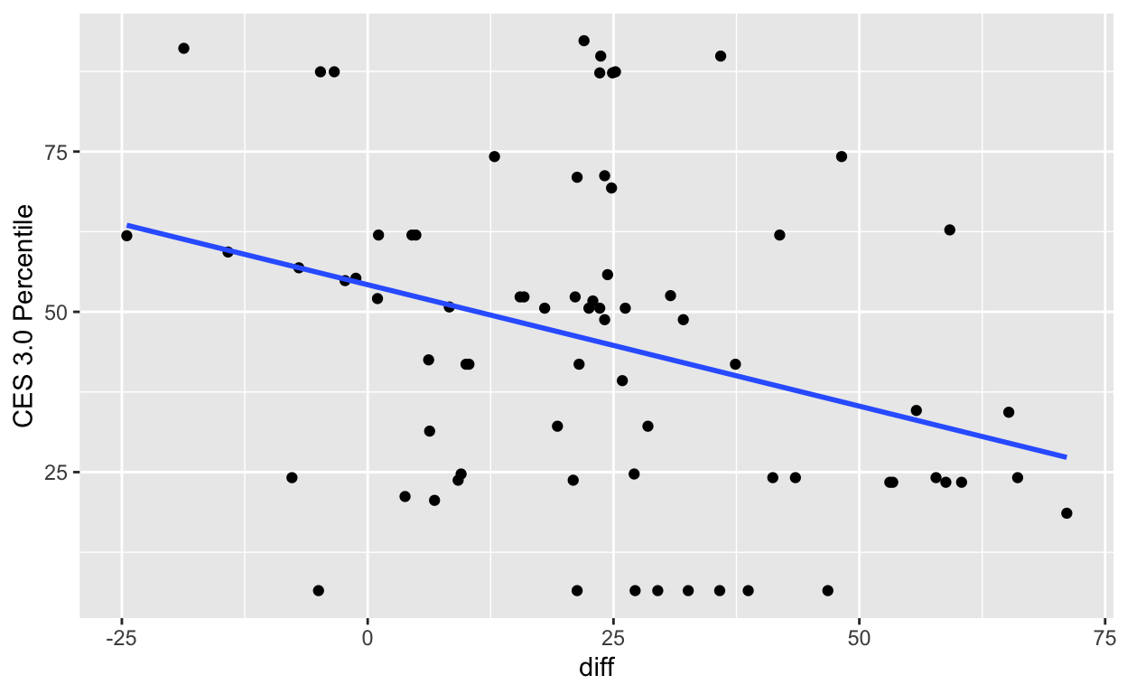
It appears that if there is any trend at all, there’s a slight negative relationship between CES and large groundwater withdrawal. This is likely because CES scores tend to be higher in and near urban areas, and most groundwater pumping takes place in rural areas away from urban development. To confirm, let’s inspect points with a difference in groundwater level >= 25 feet.
If we toggle the basemap to “Esri.WorldImagery” it’s clear that areas with large groundwater declines are on the leading edges of expanding suburban zones and in rural areas.
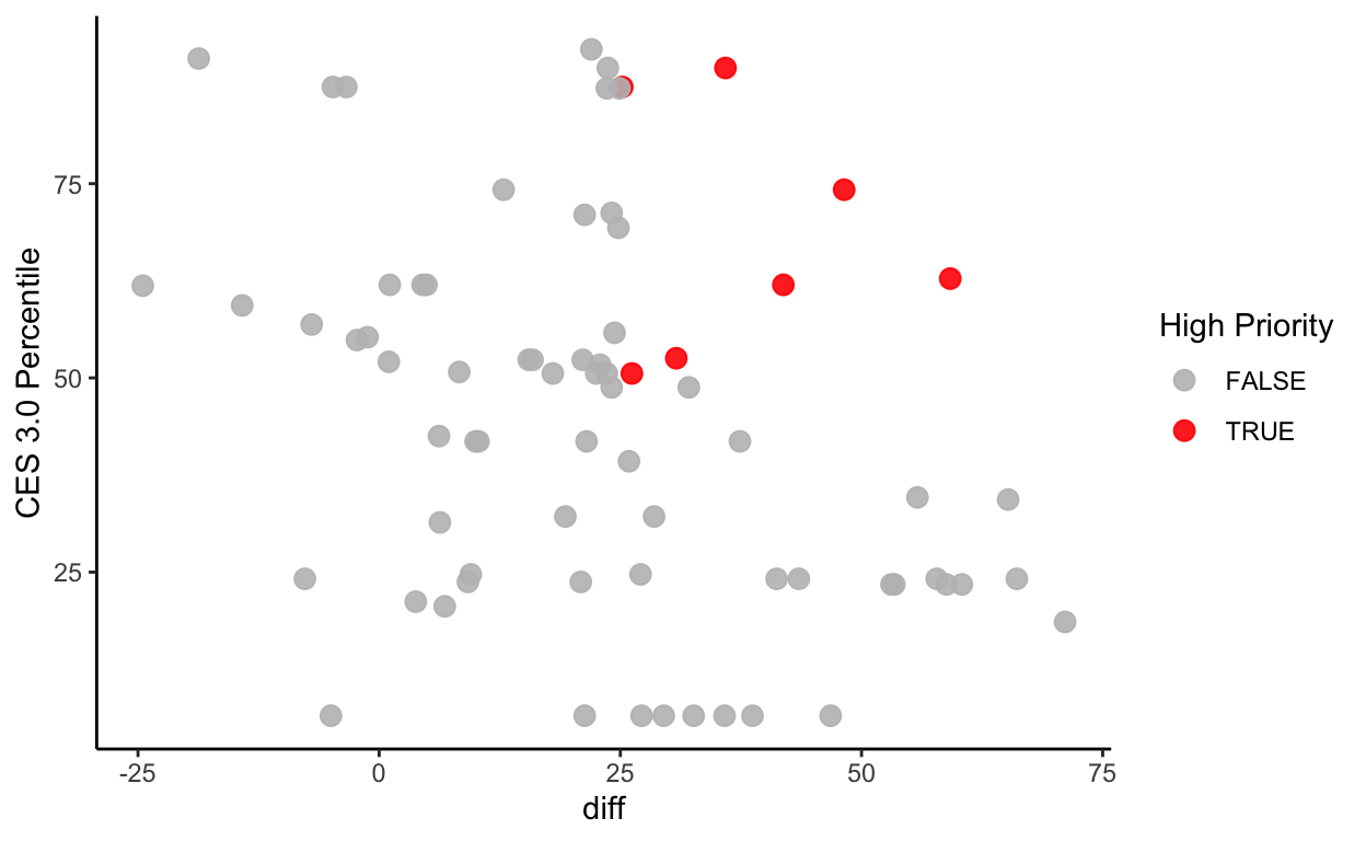
Let’s now define a class of monitoring points called
high_priority that is characterized by high CES scores and
large groundwater declines.
# add a new column "high_priority" if gwl change >= 25 feet and CES >= 50%
gwl_ces <- gwl_ces %>%
  mutate(high_priority = ifelse(diff >= 25 & `CES 3.0 Percentile` >= 50, TRUE, FALSE))

# verify that our mutate worked
gwl_ces %>%
  ggplot(aes(diff, `CES 3.0 Percentile`, color = high_priority)) +
  geom_point(size = 3, alpha = 0.9) +
  scale_color_manual(name = "High Priority", values = c("grey", "red"))+
  theme_classic()
# plot location priority
ggplot() +
  geom_sf(data = sac) +
  geom_sf(data = gwl_ces, aes(color = high_priority), size=3) +
  scale_color_manual("High Priority", values = c("grey", "red")) +
  theme_void()
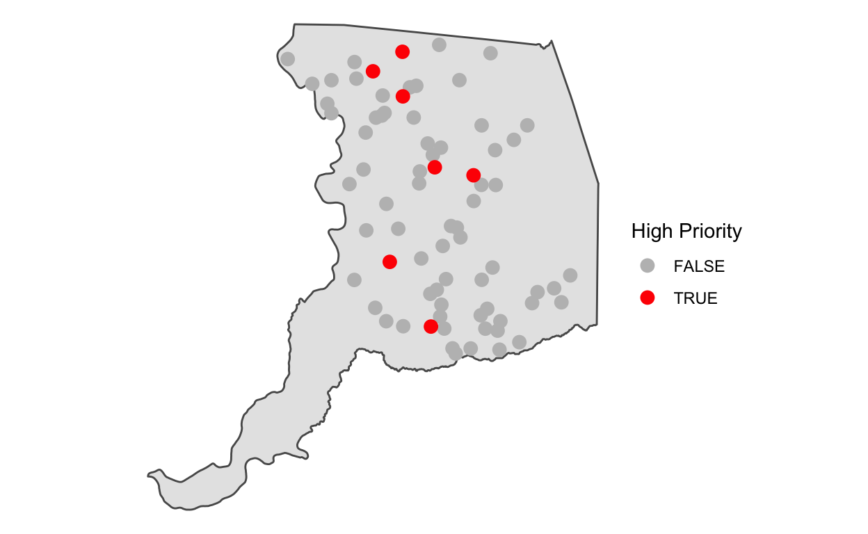
Inspecting these locations in closer detail over a satellite basemap (“Esri.WorldImagery”) may give us clues into what’s happening here.
Compared to our previous map, which only showed areas with groundwater declines >= 25 feet over the historical record, the “high priority” groundwater monitoring sites shown here with high CES scores (i.e., they are associated with census tracts that are at higher risk of impacts from environmental pollutants) appear to be located at or near the suburban fringe.
Pause and think
Did this EDA spark any questions for you? What questions would you like to explore with these data given what you’ve seen?
Learn more
EDA is the synthesis of every module we’ve covered so far, and many more that are beyond the scope of this course. As you learn more data transformation, visualization, and modeling skills, the depth of your EDA capabilities will increase. A good place to pick up general R knowledge and practice new skills is to walk through a textbook like R for Data Science, which will cover the basics and give you a good foundation on which to stand.
Communicate results
An EDA may generate tables, visualizations, text, and code that all
encapsulate the greater meaning that you’ve derived from the data. An
excellent, R-centric way to share the tables, visualizations, text, and
code that result from your EDA is to use an RMarkdown
(.Rmd) document, which is the topic of the next module.
Previous
module:
11. Spatial Data
Next
module:
13. RMarkdown
OEHHA CalEnviroscreen 3.0 data.↩︎
Statistical modeling is beyond the scope of this module, but if you are interested, you can read more about statistical modeling in R here.↩︎
This is real world data, and real world data is messy. Depths to groundwater > 250 happen all the time, but in this plot, we see that these values suddenly spike by 300 to 400 feet. It’s safe to assume that this amount of variance is physically impossible and likely due to errors in data entry. We can zoom into these data and filter them out, but the plot also tells us that we can remove these few values with a simple
filter()at the 250 ft threshold.↩︎